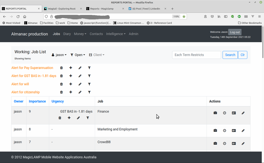
Reporting - Job List Example
I have a ReportView class based on Django's ListView class. The ReportView uses a filter object allowing me to create filters for any report. In the JobView pictured left, I have a filter for open and closed jobs, and one to filter by clients. I also have a search field which is part of the ReportView. This was inspired by the excellent Django Suit application along with some clever programming by my predecessor at INTRO Travel, Jared Quin.


A couple of tricks I picked up from the guy include a user interface trick of making small buttons with fontawesome icons to identify what they do rather than names. You will notice in the far right column of the job report, there is:
- a briefcase which takes you to the job detail page,
- a clock to determine hours spend on the job between dates (default the current pay fortnight),
- a contacts button for job contacts,
- a pencil to edit the job

